I do my work in Adobe Photoshop, one page at a time. First I'll scan an individual page at 300 dpi. Then I'll choose "Auto Adjust Brightness and Contrast" which instantly fixes up the colors. This one step can restore vibrant life to an otherwise ancient and faded story. After that's done, I'll increase the brightness just a little bit more otherwise the colors will be much too dark. Depending on how the line work looks at that point, I might darken them if they're too light (just selecting that color and going over it with black). But not usually, so far I've only really done this in the
Special Edition. (I do a lot more than just what I describe in this post when working on the Special Edition, see
this page for some more info.)
As far as the gutter space, I try to wipe that out and complety replace it with pure white, although I usually miss a few dots here and there.
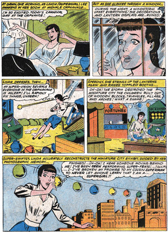
Here's a sample of how a page looks when I scan it:

This image is shrunk down, the original scan was 2200 pixels wide. When working on a page, I do so at the full scan size.
Here's how the same page looks after I've trimmed it, adjusted the brightness and contrast, and cleaned out the gutters (and, like above, shrunk it down for display in this forum):
This example is from one of the older comics. The new ones (like the
Elseworlds 80-Page Giant or the
Challengers excerpt) end up looking much nicer after they've gone through this same process because the pages aren't faded or dirty and the printing is sharper. (ie, the colors don't run past the lines or overlap each other.)
Once all the cleanup is done, I'll shrink the page down to 600 pixels wide to display it on the site. Make sure you are in RGB mode when you do this, and that all the layers are flattened. I chose 600 pixels so that the page wouldn't be wider than anyone's monitor (the smallest monitor size is 640 x 480, and 600 pixels leaves room for the browser's scroll bar) but would still be large enough to make out the dialogue. The shrinking has the added bonus of smoothing out all the patterns within the colors. ie, all the red-dots-on-white used for a flesh pattern will be shrunk down so much that they'll all merge and become an actual flesh tone.
When scanning comics, I don't really do any recoloring or reconstruction unless there's an obvious mistake, like Superman's costume accidently colored green in one panel or some illegible dialogue or something. Usually it's pretty clear that I've made a change. For instance, in the
splash page from
DCCP annual #2, Superwoman's costume was miscolored on the right hand page. The top red pieces on her thighs weren't red in the comic, they were yellow or purple or something (I don't remember) so I used a matching red to fix them. And you can tell, because that's the only part on the page where the colors are smooth.
The only exception to this is the
three part Bogdanove story where I did some artwork editing and panel re-arranging in order to remove all the "Dominus" story-line references. The changes were minimal in part one, but by the time I reached part three, they were pretty massive. The story is a lot better for it, though :-)
Many of the comics on this site are scanned from DC's archive editions or trade paperbacks so the coloring in those is already very clean. This may be what you're noticing. See
How Luthor Met Superboy, which I didn't recolor at all, but it came from one of the high quality reprints so it looks pretty good.


